Building & Designing Your Form
On the Build section of our form builder is where you can add or remove fields and change the look and feel of your form's design.

Here's how this page works:
Down the left hand side you will see several options:
- Fields - All the types of fields you can add to your form
- Blocks - non-form elements you can add such as headings and free text
- Colors - change the color scheme for your form
- Font - change the font for your form
- Settings - settings for your form's design
- Support - a link to the help center
We will explain each of these in more detail below.
Fields
To add a field to your form, click the + icon next to it or drag and drop the field onto your form. There are several types of fields you can choose from, and you can use as many as you like.
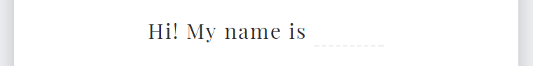
Single Line Text
A single line free text field.

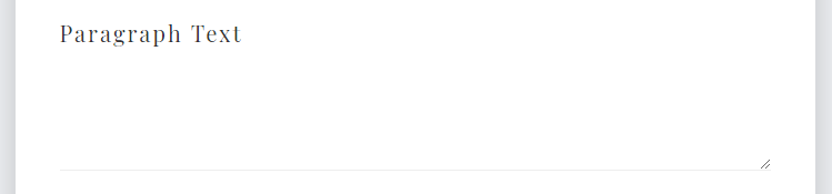
Paragraph Text
A paragraph sized free text field.
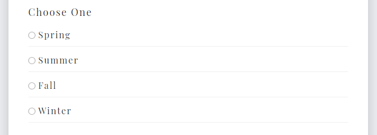
Choose One
User is forced to choose just one of several options.
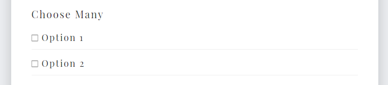
Choose Many
User can choose as many options as they like.
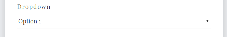
Dropdown
User can choose just one option from a dropdown list.
Natural Sentence
Field appears as part of a natural sentence.
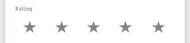
Rating
User must choose one option from a sliding scale of ratings. Several icon options are available including stars, beers, pizzas, trophies, and more.
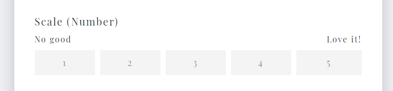
Scale (Number)
User must choose one option from a set of numbers.
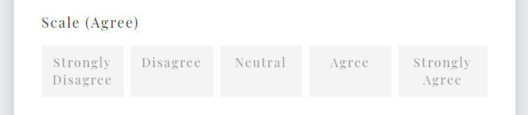
Scale (Agree)
User must choose one option from an agree/disagree scale.
Hidden Field
A hidden field you can use for data entry. Users do not have access to this field.
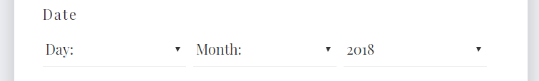
Date
Date across three dropdowns.
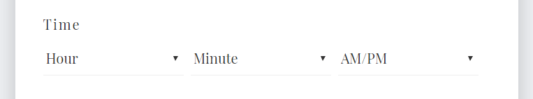
Time
Time across three dropdowns.
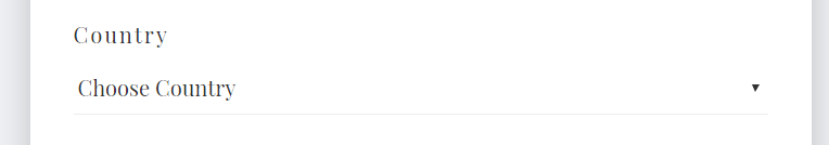
Country
A dropdown list featuring every country in the world.
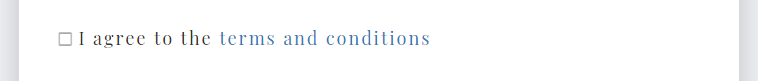
Legal
A checkbox for legal purposes including a link to relevant terms and conditions, user policies etc.
Blocks
Blocks are design elements you can drop onto your form that aren't fields. These include:
- Heading - A heading block that can have a background image or color
- Slim Heading - same as above but not as tall
- Image - an image that can appear anywhere in your form
- Text Heading - a text heading with no background image or background color
- Free Text - use this to write introduction paragraphs or extra instructions
Colors
Choose from one of our color palettes or create your own palette.
To create your own palette:
- Scroll down to the bottom of the list of color palettes and click Create Your Own Palette
- Give your palette a name
- Choose the colors you want
- Click Save in the top right corner
Font
Choose the font for your form. You can also adjust the font size and letter spacing.
Settings
Advanced settings for your form. The options are:
- Background Image - upload a background image for the entire page
- Form Shadow - enable or disable a shadow around your form. This is useful for having your form 'pop' off the page
- Progress Bar - enable or disable the progress bar. If enabled, you can choose to show just the bar (and no percentage indicator) and where to position the bar on the screen.
- Center Vertically - whether the form should be centered vertically on a user's screen (not available for all forms)
- Box The Page - add a bounding box to the page (not available for all forms)
- Whitespace Above Form - add extra whitespace above the form. This is useful for adding symetry to your form's design.
- Whitespace Below Form - add extra whitespace below the form.
- Page Title (For Google) - this is the text that appears in the top of a user's browser window when they view your form
Next, let's choose what happens after a user fills out your form.